Monday, 18 January 2016

The FT Data Blog on Oxfams big annual press release

From the FT's Chris Giles:-

Three reasons to question Oxfam’s inequality figures;

The charity Oxfam made a big splash on Monday with a report saying that the richest 62 people in the world had the same wealth as half of the world’s population. Not only that but the richest 1 per cent of the world’s population owned as much in 2015 as the rest of the 99 per cent put together.

You have to admire Oxfam’s communication skills. This is the third year it has put out such a release, it is timed impeccably to coincide with the world’s plutocrats living the high life at the World Economic Forum in Davos, and mainstream media is far from bored. Google news currently shows 385 write-ups of Oxfam’s press release.

Everyone should accept wealth inequality in the world is large. The better news is that in most people’s recent lives, the world has witnessed declining global income inequality and poverty. Those are the two big facts. (Max Roser’s website shows this and more)

So, no one should take the Oxfam numbers too seriously. But if you are inclined to, here are three additional reasons for caution.

1. The Oxfam numbers are made up

Every global economic statistic is made up to a certain extent; Oxfam’s are more than most. The charity splices together data on the richest individuals from Forbes, designed to sell magazines, with data on the rest of the world from Credit Suisse, which itself is compiled from a host of incompatible sources.

So, the authors have a responsibility to be careful with it and refrain from big claims when using it. Oxfam is a little lax, particularly making a big deal of changes in made up numbers.

2. The wealth measure is problematic

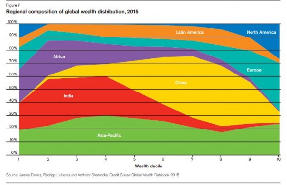
Lots of people have pointed this out, but the Credit Suisse measure of wealth is one of net worth (assets minus liabilities), so it treats a recent US graduate on a huge income, but with student debt as poorer than a subsistence farmer in China. This explains why North America appears so unequal in this chart from the Credit Suisse report.

Just so people have a sense of what you need to be in different parts of the global wealth distribution in this chart: $500 total wealth – an iPhone say – will put you in the third decile; $10,000 total wealth – an aged car say – will put you in the eighth decile; $70,000 will put you on the far right of this chart, the 10th decile; and most people owning a London property will have more than $760,000 wealth and put you in the supposed plutocrat zone of the global top 1 per cent. All these figures come from the Credit Suisse tables. Footnote 31 of the Oxfam report gets closest to reporting these useful figures, but doesn’t quite nail it.

3. The rising US dollar mucks up all the numbers

Seemingly the most interesting finding in the 2015 Oxfam press release is what it found to be a “dramatic fall in wealth of the poorest half of the world“. This comes straight from the Credit Suisse report and the reason is obvious. For a reason I do not understand, Credit Suisse aggregates domestic estimates of wealth via market exchange rates rather than Purchasing Power Parity rates, used the International Monetary Fund and others to do similar sorts of comparisons.

The effect is that wealth in every country which has depreciated against the dollar (most countries in 2015) is likely to fall unless it has grown domestically more than the depreciation. Credit Suisse wrote this in its first sentence: “Global wealth somewhat dropped in 2015 due to the strong US dollar, according to the “Global Wealth Report 2015″. Oxfam did not think this was a relevant fact to mention. As the following chart from Credit Suisse shows, the change in national wealth is almost entirely linked to the size of last year’s depreciation against the US dollar.
Posted in Data |

Wednesday, 2 December 2015

Corbyn considered

Corbyn considered by "SuperTurboFunkatron", a person in the comments section below a John Harris video on the Guardian website entitled "Corbymania collides with reality" (well worth watching):-

Ask most people what is wrong with Labour and the response will likely be "Corbyn".

Ask them why, and you'll likely get a series of muddled answers. Sometimes people have an irrational dislike for someone.

But this doesn't make them stupid, or bigots, or fascists, or anything else you might want to label them as. They're just human beings.

Now with this in mind what is the best way to change peoples opinion of someone? That is the real challenge. Name calling or worse, saying you support him as you call people names isn't going to help. So what do you do?

I don't have an answer. I don't like him. I vote Labour and unless Lib Dems get their sh*t together I'll likely never vote for any other party. I still don't like him and the only reasons I can think of are:

1. Really bad timing. Mass migration, Terrorist attacks, Bombings, etc. And he's an old tired looking man who seems to want to point at the West and condemn the West.

2. I don't feel engaged by him. I've been to a couple of rallies and heard him speak, he's actually pretty good but he's not very inspiring.

3. He's like my uncle Gerald. An old, well meaning duffer who has ideas floating around in his mind and his own agenda that he can't quite formalise... Not someone who I see as a "natural leader".

4. F*cking Londoner. I'm a Northerner, I get looked down upon and am continually told that London is better. Don't patronise me.

5. His face. Always looks miserable or withering... Like he tolerates people but thinks he knows better.

Now I know these aren't actually real reasons to dislike him, but they are in my head and he's not doing anything to change my opinion.


Saturday, 31 October 2015

USA in Syria: absolutely no chance of mission creep. No none at all.

U.S. to deploy special-ops forces in Syria to fight ISIS

"President Obama will deploy a small number of special operations forces to Kurdish-controlled territory in northern Syria as part of its effort to fight the Islamic State, the White House announced Friday, framing it as an enhancement of current strategy. Obama had long been opposed to putting boots on the ground. Up to 50 troops will be assisting and advising moderate rebels. More than a dozen parties involved in the Syrian conflict, including the U.S. and Russia, agreed Friday to work toward a cease-fire" - From the Week.

At first it was observing events, then supporting "moderate" rebels, then "targeted" bombing, then saying Assad may be allowed to to remain in any "interim" period having spent years saying he was the root of all evil, then co-ordinating bombing with Russia, then talking to Iran, then talking to everyone having sworn blind they wouldn't, now "up to 50" US special forces to be deployed. There are probably more there now anyway as even we are suposed to have some operating forces there.

What's the betting that in a few months they'll be a few more helpers. And so it will go.

A case of history repeating itself.

What a massive mess Syria is.


Friday, 9 October 2015

Memo to Corbyn and Osborne on the deficit

Summary: UK deficit still absolutely massive. Corbyn seems to think the state can spend more using the old borrow to invest line. He's wrong. Osborne keeps getting away with claiming that while hard he's a genius with the deficit. He's wrong.

From Guido Fawkes and IMF: New figures published by the IMF yesterday report Britain’s government deficit this year will still be bigger than Greece’s. The UK’s deficit in 2015 will be 4.25% as a percentage of GDP – Osborne’s preferred metric – while Greece’s will be 4.17%. The only advanced economy with a higher deficit than the UK this year is Spain…

Before the election Osborne was skewered on how Britain’s deficit compares with Greece in his worst TV appearance of the campaign. For all the talk of austerity and swingeing cuts to tax credits, the Chancellor has failed to meet his deficit targets or match the rest of the developed world…