From the FT's Chris Giles:-
Three reasons to question Oxfam’s inequality figures;
The charity Oxfam made a big splash on Monday with a report saying that the richest 62 people in the world had the same wealth as half of the world’s population. Not only that but the richest 1 per cent of the world’s population owned as much in 2015 as the rest of the 99 per cent put together.
You have to admire Oxfam’s communication skills. This is the third year it has put out such a release, it is timed impeccably to coincide with the world’s plutocrats living the high life at the World Economic Forum in Davos, and mainstream media is far from bored. Google news currently shows 385 write-ups of Oxfam’s press release.
Everyone should accept wealth inequality in the world is large. The better news is that in most people’s recent lives, the world has witnessed declining global income inequality and poverty. Those are the two big facts. (Max Roser’s website shows this and more)
So, no one should take the Oxfam numbers too seriously. But if you are inclined to, here are three additional reasons for caution.
1. The Oxfam numbers are made up
Every global economic statistic is made up to a certain extent; Oxfam’s are more than most. The charity splices together data on the richest individuals from Forbes, designed to sell magazines, with data on the rest of the world from Credit Suisse, which itself is compiled from a host of incompatible sources.
So, the authors have a responsibility to be careful with it and refrain from big claims when using it. Oxfam is a little lax, particularly making a big deal of changes in made up numbers.
2. The wealth measure is problematic
Lots of people have pointed this out, but the Credit Suisse measure of wealth is one of net worth (assets minus liabilities), so it treats a recent US graduate on a huge income, but with student debt as poorer than a subsistence farmer in China. This explains why North America appears so unequal in this chart from the Credit Suisse report.
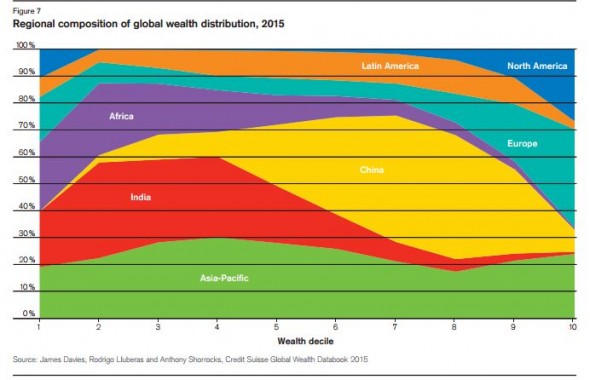
Just so people have a sense of what you need to be in different parts of the global wealth distribution in this chart: $500 total wealth – an iPhone say – will put you in the third decile; $10,000 total wealth – an aged car say – will put you in the eighth decile; $70,000 will put you on the far right of this chart, the 10th decile; and most people owning a London property will have more than $760,000 wealth and put you in the supposed plutocrat zone of the global top 1 per cent. All these figures come from the Credit Suisse tables. Footnote 31 of the Oxfam report gets closest to reporting these useful figures, but doesn’t quite nail it.
3. The rising US dollar mucks up all the numbers
Seemingly the most interesting finding in the 2015 Oxfam press release is what it found to be a “dramatic fall in wealth of the poorest half of the world“. This comes straight from the Credit Suisse report and the reason is obvious. For a reason I do not understand, Credit Suisse aggregates domestic estimates of wealth via market exchange rates rather than Purchasing Power Parity rates, used the International Monetary Fund and others to do similar sorts of comparisons.
The effect is that wealth in every country which has depreciated against the dollar (most countries in 2015) is likely to fall unless it has grown domestically more than the depreciation. Credit Suisse wrote this in its first sentence: “Global wealth somewhat dropped in 2015 due to the strong US dollar, according to the “Global Wealth Report 2015″. Oxfam did not think this was a relevant fact to mention. As the following chart from Credit Suisse shows, the change in national wealth is almost entirely linked to the size of last year’s depreciation against the US dollar.

Posted in Data | Permalink


